There are many factors to consider in email design. But do you also consider accessibility in your email marketing? Worldwide around 650 million people have a disability, approx. 246 million of them are blind or visually impaired. Through barrier-free design, these people can also use your newsletters, transactional emails and other marketing emails. But not only disabled email recipients benefit from barrier-free design. Accessibility has a positive impact on the user experience of all recipients. Use these 5 tips to make your email marketing accessible.
1. Optimize for screen readers
Screen readers are software tools that read screen texts aloud. They are used especially by visually impaired people, but also voice assistants like Alexa work according to a similar principle. In order to be rendered comprehensibly by screen readers, your content must have a logical structure. This means that your emails must be structured in such a way that the screen reader reads out the content in the correct order. It is also important that you accompany images with alt text that describes the content of the image. The content of newsletters and other marketing and service emails must be quick and easy to grasp. This is even more true for content being read by screen readers, as recipients can’t easily jump back if they don’t understand a piece of content.
2. Set contrasts and whitespace
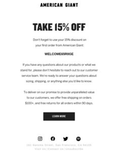
Always use strong contrasts for texts, buttons and other elements, e.g. black text on light gray background. Avoid multicolored or patterned backgrounds. Pay special attention to contrasts when placing text on images, e.g. header graphics. Use large, easily recognizable buttons instead of links marked in the text, for example. Leave enough whitespace around text blocks and other elements, i.e. “empty” space. This serves to distinguish the individual elements from each other and increases clarity. Different formatting, e.g. bolding of headings, can be used to emphasize texts.

A good example for an email with a lot of whitespace
3. Check colors
Some people cannot distinguish colors from one another, or can do so only with difficulty. For example, about 8 % of men and 0.4 % of women are affected by red-green impairment. Therefore, avoid color combinations that cannot be distinguished by recipients with color vision disorders. On the Internet, you can find various visual impairment simulators that help identify critical color combinations. In addition, avoid content references to colors (e.g., “click the green button”).
4. Offer a table of contents
For longer emails with many building blocks, integrate a table of contents that allows jumping to individual content by click or voice command. This creates orientation and prevents recipients from bouncing if the content relevant to them is only placed towards the end of the email.
5. Optimize for different devices
Emails are increasingly, and depending on the target group even primarily, used on mobile devices such as smartphones or tablets. This calls for optimising emails for the smaller screens – smaller width, shortened content, larger buttons, etc. Pay special attention to accessibility when optimizing your emails for mobile, as the small screens and lack of separate input devices make it even more difficult for people with some disabilities to use a smartphone than a stationary PC.
WHITEPAPER: MOBILE OMNICHANNEL IN DIGITAL DIALOGUE MARKETING

This is a use case from our Whitepaper: Mobile omnichannel in digital dialogue marketing. With the help of 9 further exciting use cases, we will show you how you can expand and optimise your digital dialogue marketing with mobile channels.
To download the whitepaper, simply fill out the form.