Call-to-action elements (usually flashy buttons) are often the final trigger in marketing to get a user to make a purchase, register, or take some other action. Or they serve to guide the user across several touchpoints to the final conversion: for example, from clicking on an offer in the newsletter to the final purchase in the online shop. The correct placement and design of call-to-action elements is therefore a key success factor. Even small adjustments to button colour, button size or text length can have a major impact on the click rate. This blog post will tell you what you need to consider when using and designing call-to-action elements.
A Call-to-Action (CTA) is a marketing message that asks the user to take immediate action (“Buy now” or “Subscribe to newsletter now”). This distinguishes Call-to-Actions from marketing messages that are more aimed at branding or awareness, for example. Typically, the CTA connects the message with an element (usually a button or link) that can be used to execute the action directly.
CTA elements are used in particular in online marketing, be it in newsletters, on landing pages, in push messages, or on product pages of online shops. In principle, however, Call-to-Action elements are important for all marketing measures that prompt users to take action. With CTAs, you direct your users along a defined path to a desired goal. In many cases, the CTA is the “final trigger to conversion”. Asking the user directly to make a purchase, register, or subscribe to a newsletter after perceiving the advertising message may give him the final impulse he still needs. However, it is important not to ignore the context of the Call-to-Action. As a rule, the CTA only works in combination with other elements, such as a teaser text for an article or an image for a product. Here, for example, a button with the inscription “learn more now” can be placed.
Correct placement and design of the call-to-action elements
There are essentially three forms of call-to-action elements in online marketing:

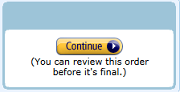
- Buttons: Call-to-Action buttons are the most used and effective form of call-to-action elements in online marketing. Users have learned that buttons usually trigger an action or redirect them to another content, e.g. a landing page.
– Buttons should stand out from the rest. The color of the button should be different from the color of the background. If this is not possible, for example, for CI reasons, the button can also stand out from the background with a thick border.
– The text color should also stand out.
– Basic rule: the stronger the contrast between the button and the background, the higher the attention.
– In any case, it should be clearly recognizable for the user that the button is a clickable element and not just an “optical gimmick”.
– The size of the button should be in the right proportion to the other elements. There is no clear “right” or “wrong” here. However, “not higher than two lines of text” and “not wider than the associated content” are good guidelines. A button that takes up more space than the associated teaser text, for example, is too intrusive in most cases and is more likely to remind you of dubious providers who send spam mails for gambling offers, for example.
– Leave enough space between the button and other content (e.g. text) so that the button stands out and the user is not distracted by the other elements.
– If you use several buttons, it must always be clear to which content a button belongs. It is advisable to separate the different contents from each other in terms of design. For example, use different background colours, dividing lines between the contents, images or headlines.
– It is best to place the buttons under the corresponding content. This is what most users have learned. “From top to bottom” also corresponds to the way content is consumed, at least in Western cultures. For example, a user who reads a teaser text will probably not jump to the beginning of the text to search for the button.
– Test different button designs and placements. Rules of thumb help, but you won’t know what really works best until you try it out. - Linked texts: Instead of a button you can also simply link a text. This is less attention-grabbing than a button. However, text links work well, especially with editorial content, if the links fit into the flow of reading. For example, place the first lines of an article as a teaser in your newsletter and end the teaser with a linked “Read more” in the text. In most cases, however, you should rather use linked texts as support for another CTA element. For example, if you advertise a download in your newsletter, you can not only place a button but also link the word “download” or the title of the download in the descriptive text. In any case, the linked text should stand out from the rest of the text in terms of colour so that the user realises that it is a clickable link.
- Graphics: You can also use large graphics as a CTA element, such as newsletter headers or sliders on your website. However, the graphic must show that it is a clickable element. It is recommended that you add text to the graphic or an element that looks like a Call-to-Action button. If you place the graphics in the upper view area of your marketing measure, e.g. as the header of an email campaign, you can easily entice the user to click quickly before he has even thought about the measure.

Formulate Call-to-Actions correctly
When formulating the CTA texts, the rule of thumb is: less is more. Half a dozen words should be the upper limit. However, if there is a need for additional explanation, you can add the explanation to the actual call-to-action element.
If you include a phrase such as “I” or “me” in the CTA (Yes, I would like to inform myself…) the user feels personally addressed. However, the choice of words should remain serious. No one should feel compelled to take action. Even formulations that contain a certain urgency and temporal relevance can have a positive effect. Examples for such a design are, among others, “download now” or “register today”.
Examples of Call-to-Actions
In the following we have compiled a few examples of calls-to-action formulations for different contexts:
In the editorial context
- I would like to know more
- Read more
- Curious? – Read on
- Read the whole article
- Download now
- I would like to receive the Whitepaper
In the video context
- Look at it now
- Experience this story
- This video will change you
- I would like to profit from the experience
In the event context
- Reserve a seat now
- Register now
- Book your tickets now
- I will be there
- I’m in
- Save me a seat
- Register today
In the feedback context
- Fill out our 5-minute survey
- Leave some feedback
- Give us your feedback
- Let us know if/how you enjoyed it
- I would like to support company xyz
- My opinion counts
In the shopping context
- Buy now
- Shop our new collection now
- Buy now. Pay later.
- 50% discount for you
- Order now free of shipping costs
- Order now
- I want to test the new spring collection
Further examples
- Book your next appointment now
- Start your trial month now
- Get your upgrade now
- Make me a VIP
- Like us on Facebook
Conclusion
Especially in online marketing, Call-to-Action elements are an almost indispensable tool. They offer you the opportunity to motivate your users to take desired actions. The implementation is simple, but there are a few things to consider. With clever design, placement and formulation and a little testing, however, good solutions can be found quickly to help you improve your conversion rate.